
Tomahawk panelGrid tag
This tag is used create compound component that is used to layout other components. This tag renders html table with specified no. of columns. Children of this element are rendered in cells of the columns of the table. This tag helps to construct the table which can automatically arrange the elements in cells of the table of specified columns. Suppose, we have specified no. of columns to 3 and we have taken 5 elements then these elements will get automatically arranged in two rows (3 elements in 3 columns consecutively in the the first row and other 2 in the second row in the same manner. So last two elements will be visible in two columns and third will be blank. For more stylish and customized appearance CSS can be used. By default the no. of columns is "1". The no. of rows is decided by the no. of elements to display in the specified no. of columns.
Code Description :
<%@ taglib uri="http://java.sun.com/jsf/html" prefix="h"%>
<%@ taglib uri="http://java.sun.com/jsf/core" prefix="f"%>
<%@ taglib uri="http://myfaces.apache.org/tomahawk" prefix="t"%>
<html>
<head>
<meta http-equiv="Content-Type" content="text/html; charset=iso-8859-1">
<title>t:panelGrid example</title>
<style type="text/css">
<!--
body{
margin-top:30;
}
.highlight { background-color: #A8D1E8; color:#000000;}
.TableRow1 {
    background-color: #D0E6E0;
}
.TableRow2 {
    background-color: #E8F7F1;
}
.TableColumn {
    text-align: center
}
.TableClass {
	font-family : verdana, Geneva, Arial, Helvetica, sans-serif;
	font-size: 13px;
	color: #000000;
    padding: 2;
    border-style: solid;
    border-width: 2px;
}
.TableHeader {
	color: #000000;
    background-color: #F1F1F1;
    padding: 3;
    text-align: center;
    border: none;
}
.TableFooter {
    background-color: #F1F1F1;
}
-->
</style>
</head>
<body ><center>
<f:view>
  <h:form id="form1" >
    <t:panelGrid id="dt1" bgcolor="#F1F1F1" columns="2" border="10"
        cellpadding="5" cellspacing="3" dir="LTR" frame="hsides"
         rules="all" summary="This is a JSF code to create panelGrid."
         rowClasses="TableRow1,TableRow2" columnClasses="TableColumn"
         styleClass="TableClass" headerClass="TableHeader"
         footerClass="TableFooter" >
      <f:facet name="header">
	 <h:outputText value="Customer Profile" />
      </f:facet>
      <t:panelGroup >
	<t:panelGrid columns="2" style="color:green;">
	  <f:facet name="header">
	    <h:outputText value="Personal Information"
                          style="color:#006699;"/>
	  </f:facet>
	  <t:outputText value="Name"></t:outputText>
	  <t:inputText onmouseover="this.className='highlight'"
                       onmouseout="this.className='normal'"/>
          <t:outputText value="Contact Number"
                        onmouseover="this.className='highlight1'"
                        onmouseout="this.className='normal'">
          </t:outputText>
	  <t:inputText onmouseover="this.className='highlight'"
                       onmouseout="this.className='normal'"/>
	</t:panelGrid>
      </t:panelGroup>
      <t:panelGroup >
	<t:panelGrid columns="2" style="color:green;">|
          <f:facet name="header">
             <h:outputText value="Educational Information"
                           style="color:#006699;"/>
          </f:facet>
          <t:outputText value="Certificate Name" ></t:outputText>
          <t:inputText onmouseover="this.className='highlight'"
                       onmouseout="this.className='normal'"/>
          <t:outputText value="Year"></t:outputText>
          <t:inputText onmouseover="this.className='highlight'"
                       onmouseout="this.className='normal'"/>
	</t:panelGrid>
      </t:panelGroup>
      <t:panelGroup colspan="2" >
        <t:panelGrid columns="4" width="100%"
                     style="color:green;">
	   <f:facet name="header">
	      <h:outputText value="Achievements & Awards"
                            style="color:#006699;"/>
	   </f:facet>
	   <t:outputText value="Name"></t:outputText>
	   <t:inputText onmouseover="this.className='highlight'"
                        onmouseout="this.className='normal'"/>
	   <t:outputText value="Year"></t:outputText>
	   <t:inputText onmouseover="this.className='highlight'"
                        onmouseout="this.className='normal'"/>
           <t:outputText value="Name"></t:outputText>
	   <t:inputText onmouseover="this.className='highlight'"
                        onmouseout="this.className='normal'"/>
	   <t:outputText value="Year"></t:outputText>
	   <t:inputText onmouseover="this.className='highlight'"
                        onmouseout="this.className='normal'"/>
	</t:panelGrid>
      </t:panelGroup>
      <f:facet name="footer">
	<h:outputText value="**  Your information will be kept secret." />
      </f:facet>
</t:panelGrid><br><br>
</h:form>
</f:view>
</center></body>
</html>
|
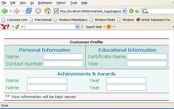
Rendered Output :
Html Source Code :
<html>
<head>
<meta http-equiv="Content-Type" content="text/html; charset=iso-8859-1">
<title>t:panelGrid example</title>
<style type="text/css">
<!--
body{
margin-top:30;
}
.highlight { background-color: #A8D1E8; color:#000000;}
.TableRow1 {
background-color: #D0E6E0;
}
.TableRow2 {
background-color: #E8F7F1;
}
.TableColumn {
text-align: center
}
.TableClass {
font-family : verdana, Geneva, Arial, Helvetica, sans-serif;
font-size: 13px;
color: #000000;
padding: 2;
border-style: solid;
border-width: 2px;
}
.TableHeader {
color: #000000;
background-color: #F1F1F1;
padding: 3;
text-align: center;
border: none;
}
.TableFooter {
background-color: #F1F1F1;
}
-->
</style>
</head>
<body ><center>
<form id="form1" name="form1" method="post"
action="/tomahawk_tags/pages/panelGrid.jsf"
enctype="application/x-www-form-urlencoded">
<table id="form1:dt1" bgcolor="#F1F1F1" border="10"
cellpadding="5" cellspacing="3" frame="hsides"
rules="all" summary="This is a JSF code to create panelGrid."
dir="LTR" class="TableClass">
<thead><tr><th class="TableHeader" scope="colgroup" colspan="2">
Customer Profile
</th></tr></thead>
<tfoot><tr><td class="TableFooter" colspan="2">
** Your information will be kept secret.
</td></tr></tfoot><tbody><tr class="TableRow1">
<td class="TableColumn"><table style="color:green;">
<thead><tr><th scope="colgroup" colspan="2">
<span style="color:#006699;">Personal Information</span>
</th></tr></thead><tbody><tr><td>Name</td><td>
<input id="form1:_idJsp5" name="form1:_idJsp5" type="text"
value="" onmouseover="this.className='highlight'"
onmouseout="this.className='normal'" /></td></tr>
<tr><td><span onmouseover="this.className='highlight1'"
onmouseout="this.className='normal'">Contact Number</span></td>
<td><input id="form1:_idJsp7" name="form1:_idJsp7" type="text"
value="" onmouseover="this.className='highlight'"
onmouseout="this.className='normal'" /></td></tr>
</tbody></table></td><td><table style="color:green;">
<thead><tr><th scope="colgroup" colspan="2">
<span style="color:#006699;">Educational Information</span>
</th></tr></thead><tbody><tr><td>Certificate Name</td><td>
<input id="form1:_idJsp12" name="form1:_idJsp12" type="text"
value="" onmouseover="this.className='highlight'"
onmouseout="this.className='normal'" /></td></tr>
<tr><td>Year</td><td><input id="form1:_idJsp14"
name="form1:_idJsp14" type="text" value=""
onmouseover="this.className='highlight'"
onmouseout="this.className='normal'" /></td></tr>
</tbody></table></td></tr>
<tr class="TableRow2"><td class="TableColumn"
colspan="2"><table width="100%" style="color:green;">
<thead><tr><th scope="colgroup" colspan="4">
<span style="color:#006699;">Achievements & Awards</span>
</th></tr></thead><tbody><tr><td>Name</td><td>
<input id="form1:_idJsp19" name="form1:_idJsp19" type="text"
value="" onmouseover="this.className='highlight'"
onmouseout="this.className='normal'" /></td><td>Year</td>
<td><input id="form1:_idJsp21" name="form1:_idJsp21"
type="text" value="" onmouseover="this.className='highlight'"
onmouseout="this.className='normal'" /></td></tr>
<tr><td>Name</td><td><input id="form1:_idJsp23"
name="form1:_idJsp23" type="text" value=""
onmouseover="this.className='highlight'"
onmouseout="this.className='normal'" /></td><td>Year</td>
<td><input id="form1:_idJsp25" name="form1:_idJsp25"
type="text" value="" onmouseover="this.className='highlight'"
onmouseout="this.className='normal'" /></td></tr>
</tbody></table></td></tr>
</tbody></table><br><br>
<input type="hidden" name="form1_SUBMIT"
value="1" /><input type="hidden" name="javax.faces.ViewState"
id="javax.faces.ViewState" value="rO0ABXVyABNbTGphdmEubGFuZy5PYmp
lY3Q7kM5YnxBzKWwCAAB4cAAAAAN0AAExcHQAFC9wYWdlcy9wYW5lbEdyaWQuanNw" />
</form>
</center><!-- MYFACES JAVASCRIPT -->
</body>
</html>
This tag contains attributes given below :
- id : This is the value which is used to uniquely identify the component within the closest container like form or subview. The main thing to remember is that its value must be a static value.
- binding : This attribute is used to specify the property of the backing bean with which this component instance is to be bound.
- rendered : Its default value is true. If this attribute is set to true then this component is presented in the page to the user. If false, then this component is not rendered.
- columnClasses : Comma seperated list of CSS classes that will be applied to the columns of this table.
- footerClass : This attribute takes Space-separated list of CSS style class or classes that will be applied to aheaderter generated for this table.
- headerClass :This attribute takes Space-separated list of CSS style class or classes that will be applied to any header generated for this table.
- rowClasses :It is a list of CSS classes applied to the rows of the table. These classes should be separated by comma. If we want to apply CSS class for individual rows then we can specify space separated list of CSS classes. Style classes are applied to rows in the same order that they are defined. If we have two CSS classes then first class is applied to the first row and the second one is applied to the second. Then again in the third row, the first CSS is applied and so on. This process goes on till the last row of the table.
- dir : It is used to set the direction of the text to be displayed. It can take two values LTR(left to right) and RTL (right to left).
- lang : It is used to set the base language of the component when displayed.
- style : It is used to set the CSS style definition for the component.
- title : It is the standard html attribute. It is used to set the tooltip text for this component.
- styleClass : It is used to set the CSS class for the component. It is same as html class attribute.
- onclick : Script to be invoked when the element is clicked.
- ondblclick : It is used for Java Script code to be invoked when the element is double-clicked.
- onmousedown : It is used for Java Script code to be invoked when the pointing device is pressed over this element.
- onmouseup : It is used for Java Script code to be invoked when the pointing device is released over this element.
- onmouseover : It is used for Java Script code to be invoked when the pointing device is moved into this element.
- onmousemove : It is used for Java Script code to be invoked when the pointing device is moved while it is in this element.
- onmouseout : It is used for Java Script code to be invoked when the pointing device is moved out of this element.
- onkeypress : It is used for Java Script code to be invoked when a key is pressed over this element.
- onkeydown : It is used for Java Script code to be invoked when a key is pressed down over this element.
- onkeyup : It is used for Java Script code to be invoked when a key is released over this element.
- align : This attribute is used to set the horizontal alignment of the component.
- border : This attribute is used to specify the width of the border of this element.
- bgcolor : This attribute is used to specify background color of the element.
- cellpadding : This sets the space between the content and the border of the cell.
- cellspacing : It specifies the amount of space to leave between cells.
- frame : This
attribute specifies which sides of the frame surrounding this table will be
visible. This attribute can take some values shown below :
- none No side, Default Value
- above Top side only
- below Bottom side only
- hsides Top and bottom sides only
- vsides Right and left sides only
- lhs Left hand side only
- rhs Right hand side only
- box All four sides
- border All four sides
- rules : This
attribute is used to draw lines between cells. It can take some values given
below :
- none No rules, default value
- groups Between row groups
- rows Between rows only
- cols Between columns only
- all Between all rows and columns
- summary : You can specify summary of the purpose of the table.
- width : This is used to set the width of the component. Its value can be specified in pixels or %. Suppose we set it to 50% then this table will be shown in the 50% space of the width of your screen.
- columns : This attribute is used to specify the no. of columns to be displayed in a row.
- enabledOnUserRole : If the current user has one of the roles listed in the enabledOnUserRole attribute then enabling or disabling of the component is decided on the base of "disabled" attribute. If disabled attribute is set to true then component is disabled otherwise enabled. If the user is not in the above list then the component is rendered disabled.
- visibleOnUserRole :If the current user has one of the roles listed in the visibleOnUserRole attribute then processing of the component is decided on the base of "rendered" attribute. If the rendered attribute is set to true then component is not rendered otherwise displayed on the page. On the other hand if the current user is not in the above list then the component is not processed.
- forceId : This is a boolean attribute with default value false. If this attribute is set to true, the tag is forced to render the id for the component exactly as mentioned in the id attribute of the tag. The benefit of this attribute is that we can reference component by id in the javascript. If we don't use this attribute with the true value then the id for the component is presented in different format.
- forceIdIndex : This is a boolean attribute with default value true. If this value is true then the the component displays the index number in its id value if the component is in a list. If this attribute is set to false then this component will not append index number as suffix . If forcrId is set to false then its value is ignored.
- displayValueOnly : This is boolean attribute with the default value false. If this value is set to true then only the value of the component is rendered not the widget of the component.
- displayValueOnlyStyle : This attribute is used to specify the style used when displayValueOnly is true.
- displayValueOnlyStyleClass : This attribute is used to specify the style class used when displayValueOnly is true.