Tomahawk message tag
This tag is useful in displaying the message related with a particular component. The component for which the error message is to be displayed is decided in for attribute of the tag. You can display summarized message and detailed message for the component. We can use different CSS styles and class with different type of messages on different severity. We can change the format of the message string.
Code Description :
<%@ taglib uri="http://java.sun.com/jsf/html" prefix="h"%>
<%@ taglib uri="http://java.sun.com/jsf/core" prefix="f"%>
<%@ taglib uri="http://myfaces.apache.org/tomahawk" prefix="t"%>
<html>
<head>
<meta http-equiv="Content-Type" content="text/html; charset=iso-8859-1">
<title>t:message example</title>
<style type="text/css">
<!--
body{
background-color:#fff2f2;
margin-top:30;
}
-->
</style>
</head>
<body ><center>
<f:view>
<h:form id="form1" >
  <h:panelGrid id="pg" columns="2"
	 style="background-color:#66CCFF;">
      <t:outputLabel id="ol1" for="UserName" value="User Name"
	 style="font-weight:bold"/>
      <t:panelGroup>
	 <t:inputText id="UserName" required="true"/>
	 <f:verbatim></br></f:verbatim>
	 <t:message for="UserName" replaceIdWithLabel="true"
         style="font-style:Italic;"/>
      </t:panelGroup>
      <t:outputLabel id="ol2" for="Password" value="Password"
         style="font-weight:bold"/>
      <t:panelGroup>
	<t:inputSecret id="Password" required="true"/>
	<f:verbatim></br></f:verbatim>
	<t:message for="Password" replaceIdWithLabel="true"
         style="font-style:Italic;"/>
      </t:panelGroup>
	<t:outputText value=" " />
	<t:commandButton id="btnSubmit" value="Submit"
                action="welcome"
                style="border-color:#000000;font-weight:bold"/>
  </h:panelGrid>
</h:form>
</f:view>
</center></body>
</html>
|
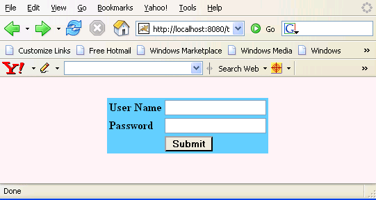
Rendered Output : This is the first look that a user experiences.
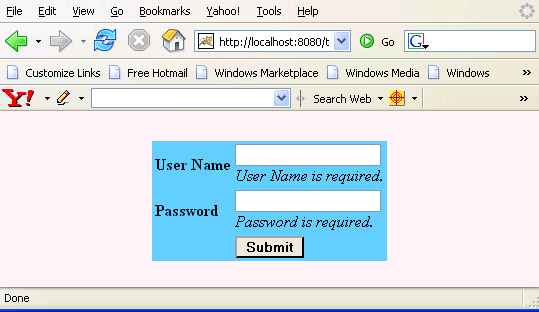
If the user doesn't fill the fields in the form then error messages are rendered as in the figure below :
Html Source Code :
<html>
<head>
<meta http-equiv="Content-Type" content="text/html; charset=iso-8859-1">
<title>t:message example</title>
<style type="text/css">
<!--
body{
background-color:#fff2f2;
margin-top:30;
}
-->
</style>
</head>
<body ><center>
<form id="form1" name="form1" method="post"
   action="/tomahawk_tags/pages/message.jsf"
   enctype="application/x-www-form-urlencoded">
  <table id="form1:pg" style="background-color:#66CCFF;">
    <tbody><tr><td><label id="form1:ol1" style="font-weight:bold"
    for="form1:UserName">User Name</label></td><td>
    <input id="form1:UserName" name="form1:UserName"
        type="text" value="" /></br></td></tr>
    <tr><td><label id="form1:ol2" style="font-weight:bold"
       for="form1:Password">Password</label></td><td><input
       type="password" id="form1:Password" name="form1:Password" />
       </br></td></tr>
    <tr><td> </td><td><input id="form1:btnSubmit"
      name="form1:btnSubmit" type="submit" value="Submit"
      onclick="if(typeof window.clearFormHiddenParams_form1!='undefined')
      {clearFormHiddenParams_form1('form1');}"
      style="border-color:#000000;font-weight:bold" /></td></tr>
</tbody></table>
	<input type="hidden" name="form1_SUBMIT" value="1" />
        <input type="hidden" name="form1:_link_hidden_" />
        <input type="hidden" name="form1:_idcl" />
<script type="text/javascript"><!--
	function clear_form1(){
		clearFormHiddenParams_form1('form1');
	}
	function clearFormHiddenParams_form1(currFormName){
		var f = document.forms['form1'];
		f.elements['form1:_link_hidden_'].value='';
		f.elements['form1:_idcl'].value='';
		f.target='';
	}
	clearFormHiddenParams_form1();
//--></script><input type="hidden" name="javax.faces.ViewState"
     id="javax.faces.ViewState"
value="rO0ABXVyABNbTGphdmEubGFuZy5PYmplY3Q7kM5YnxBzKWwCAAB4cAAAAAN0AAI1
NnB0ABIvcGFnZXMvbWVzc2FnZS5qc3A=" /></form>
</center><!-- MYFACES JAVASCRIPT --> </body> </html> |
This tag contains attributes given below :
- id : This is the value which is used to uniquely identify the component within the closest container like form or subview. The main thing to remember is that its value must be a static value.
- binding : This attribute is used to specify the property of the backing bean with which this component instance is to be bound.
- rendered : Its default value is true. If this attribute is set to true then this component is presented in the page to the user. If false, then this component is not rendered.
- for : This attribute is used to specify the id of the component for which the message is to be displayed.
- showSummary : This is a boolean attribute to indicate whether the summary text of the message to display.
- showDetail : This is a boolean attribute to indicate whether the detail text of the message to display.
- dir : It is used to set the direction of the text to be displayed. It can take two values LTR(left to right) and RTL (right to left).
- lang : It is used to set the base language of the component when displayed.
- style : It is used to set the CSS style definition for the component.
- title : It is the standard html attribute. It is used to set the tooltip text for this component.
- styleClass : It is used to set the CSS class for the component. It is same as html class attribute.
- onclick : Script to be invoked when the element is clicked.
- ondblclick : It is used for Java Script code to be invoked when the element is double-clicked.
- onmousedown : It is used for Java Script code to be invoked when the pointing device is pressed over this element.
- onmouseup : It is used for Java Script code to be invoked when the pointing device is released over this element.
- onmouseover : It is used for Java Script code to be invoked when the pointing device is moved into this element.
- onmousemove : It is used for Java Script code to be invoked when the pointing device is moved while it is in this element.
- onmouseout : It is used for Java Script code to be invoked when the pointing device is moved out of this element.
- onkeypress : It is used for Java Script code to be invoked when a key is pressed over this element.
- onkeydown : It is used for Java Script code to be invoked when a key is pressed down over this element.
- onkeyup : It is used for Java Script code to be invoked when a key is released over this element.
- infoClass : This attribute is used to specify the CSS class to be used for messages with severity "INFO".
- infoStyle : This attribute is used to specify the CSS style to be used for messages with severity "INFO".
- warnClass : This attribute is used to specify the CSS class to be used for messages with severity "WARN".
- warnStyle : This attribute is used to specify the CSS style to be used for messages with severity "WARN".
- errorClass : This attribute is used to specify the CSS class to be used for messages with severity "ERROR".
- errorStyle : This attribute is used to specify the CSS style to be used for messages with severity "ERROR".
- fatalClass : This attribute is used to specify the CSS class to be used for messages with severity "FATAL".
- fatalStyle : This attribute is used to specify the CSS style to be used for messages with severity "FATAL".
- tooltip : This attribute is used to render the message summary as a tooltip, if set to true.
- enabledOnUserRole : If the current user has one of the roles listed in the enabledOnUserRole attribute then enabling or disabling of the component is decided on the base of "disabled" attribute. If disabled attribute is set to true then component is disabled otherwise enabled. If the user is not in the above list then the component is rendered disabled.
- visibleOnUserRole : If the current user has one of the roles listed in the visibleOnUserRole attribute then processing of the component is decided on the base of "rendered" attribute. If the rendered attribute is set to true then component is not rendered otherwise displayed on the page. On the other hand if the current user is not in the above list then the component is not processed.
- forceId : This is a boolean attribute with default value false. If this attribute is set to true, the tag is forced to render the id for the component exactly as mentioned in the id attribute of the tag. The benefit of this attribute is that we can reference component by id in the javascript. If we don't use this attribute with the true value then the id for the component is presented in different format.
- forceIdIndex : This is a boolean attribute with default value true. If this value is true then the the component displays the index number in its id value if the component is in a list. If this attribute is set to false then this component will not append index number as suffix . If forcrId is set to false then its value is ignored.
- summaryFormat : This attribute is to change the format of the summary message to be displayed.
- detailFormat : This attribute is to change the format of the summary message to be displayed.
- replaceIdWithLabel : This is a boolean attribute with default value true. If it is true then all the occurrences of the id are replaced by the label of component for which the validation message is to be displayed.
- forceSpan : This attribute displays an empty span element if its value is true.