Tomahawk inputText tag
This tag is used to create the input text box in the page. The user can enter any text in this box. This is same as html input tag with type "text". This tag has additional feature of displaying value only, not the widget of the box. You can set the style definition and style class when this attribute is set to true. This component also has ability to be visible or not visible according to the role of the user. In the same way, it also has the ability to be enable or disable according to the user role. This component also has the capability to render the id for the component just the same as we have mentioned in the id attribute of the tag. Normally the naming system of JSF renders the id for the component with some additional text, typically with id of the form as prefix. But this component has an attribute forceId which forces the component to render the same id mentioned in the id attribute.
Code Description :
<%@ taglib uri="http://java.sun.com/jsf/html" prefix="h"%>
<%@ taglib uri="http://java.sun.com/jsf/core" prefix="f"%>
<%@ taglib uri="http://myfaces.apache.org/tomahawk" prefix="t"%>
<f:view>
<html>
<head>
<meta http-equiv="Content-Type" content="text/html; charset=iso-8859-1">
<title>t:inputText example</title>
<style type="text/css">
<!--
body{
background-color:#fff2f2;
margin-top:30;
}
.inputstyle{
background-color:#99CCCC;
}
-->
</style>
</head>
<body >
<h:form>
<center>
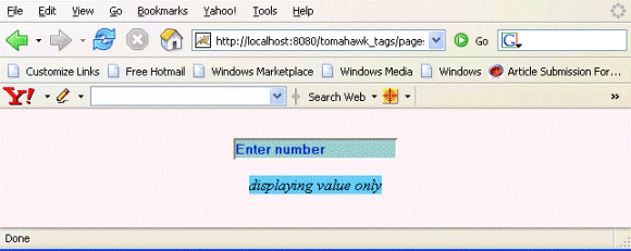
<t:inputText id="it1" value="Enter number" rendered="true" required="false"
dir="ltr" style="color:#0033CC; font-weight:bold"
styleClass="inputstyle"
title="Enter the number of your choice."/></p>
<t:inputText id="it2" value="displaying value only" rendered="true"
required="false" dir="ltr"
style="color:#0033CC; font-weight:bold" styleClass="inputstyle"
title="This is input text box but displaying value only"
displayValueOnly="true"
displayValueOnlyStyle="font-style: italic;
color:#000000; background-color:#66CCFF;"/>|
</center>
</h:form>
</body>
</html>
</f:view>
Rendered Output :
Html Source Code :
<html>
<head>
<meta http-equiv="Content-Type" content="text/html; charset=iso-8859-1">
<title>t:inputText example</title>
<style type="text/css">
<!--
body{
background-color:#fff2f2;
margin-top:30;
}
.inputstyle{
background-color:#99CCCC;
}
-->
</style>
</head>
<body >
<form id="_idJsp0" name="_idJsp0" method="post"
action="/tomahawk_tags/pages/inputText.jsf"
enctype="application/x-www-form-urlencoded">
<center>
<input id="_idJsp0:it1" name="_idJsp0:it1" type="text"
value="Enter number" dir="ltr"
title="Enter the number of your choice." style="color:#0033CC;
font-weight:bold" class="inputstyle" /></p>
<span id="_idJsp0:it2" style="font-style: italic; color:#000000;
background-color:#66CCFF;" class="inputstyle" dir="ltr"
title="This is input text box but displaying value only">
displaying value only
</span>
</center>
<input type="hidden" name="_idJsp0_SUBMIT" value="1" />
<input type="hidden" name="javax.faces.ViewState" id="javax.faces.ViewState"
value="rO0ABXVyABNbTGphdmEubGFuZy5PYmplY3Q7kM5YnxBzKWwCAAB4cAAAAANzcg
BHb3JnLmFwYWNoZS5teWZhY2VzLmFwcGxpY2F0aW9uLlRyZWVTdHJ1Y3R1cmVN
YW5hZ2VyJFRyZWVTdHJ1Y3RDb21wb25lbnRGWRfYnEr2zwIABFsACV9jaGlsZH
JlbnQASltMb3JnL2FwYWNoZS9teWZhY2VzL2FwcGxpY2F0aW9uL1RyZWVTdHJ1
Y3R1cmVNYW5hZ2VyJFRyZWVTdHJ1Y3RDb21wb25lbnQ7TAAPX2NvbXBvbmVudE
NsYXNzdAASTGphdmEvbGFuZy9TdHJpbmc7TAAMX2NvbXBvbmVudElkcQB+AARb
AAdfZmFjZXRzdAATW0xqYXZhL2xhbmcvT2JqZWN0O3hwdXIASltMb3JnLmFwYW
NoZS5teWZhY2VzLmFwcGxpY2F0aW9uLlRyZWVTdHJ1Y3R1cmVNYW5hZ2VyJFRy
ZWVTdHJ1Y3RDb21wb25lbnQ7uqwnyBGFkKoCAAB4cAAAAAFzcQB+AAJ1cQB+AA
cAAAACc3EAfgACcHQAM29yZy5hcGFjaGUubXlmYWNlcy5jb21wb25lbnQuaHRt
bC5leHQuSHRtbElucHV0VGV4dHQAA2l0MXBzcQB+AAJwcQB+AAx0AANpdDJwdA
AjamF2YXguZmFjZXMuY29tcG9uZW50Lmh0bWwuSHRtbEZvcm10AAdfaWRKc3Aw
cHQAIGphdmF4LmZhY2VzLmNvbXBvbmVudC5VSVZpZXdSb290cHB1cQB+AAAAAA
ADdXEAfgAAAAAABXVxAH4AAAAAAAdwcHBwcHBwc3IAEGphdmEudXRpbC5Mb2Nh
bGV++BFgnDD57AIABEkACGhhc2hjb2RlTAAHY291bnRyeXEAfgAETAAIbGFuZ3
VhZ2VxAH4ABEwAB3ZhcmlhbnRxAH4ABHhw/////3QAAHQAAmVucQB+ABh0AApI
VE1MX0JBU0lDdAAUL3BhZ2VzL2lucHV0VGV4dC5qc3BzcgAOamF2YS5sYW5nLk
xvbmc7i+SQzI8j3wIAAUoABXZhbHVleHIAEGphdmEubGFuZy5OdW1iZXKGrJUd
C5TgiwIAAHhwAAAAAAAAAABwc3IAE2phdmEudXRpbC5BcnJheUxpc3R4gdIdmc
dhnQMAAUkABHNpemV4cAAAAAF3BAAAAAF1cQB+AAAAAAADdXEAfgAAAAAAFnVx
AH4AAAAAAAdxAH4AEXB0ABBqYXZheC5mYWNlcy5Gb3JtcQB+ABFzcgARamF2YS
51dGlsLkhhc2hNYXAFB9rBwxZg0QMAAkYACmxvYWRGYWN0b3JJAAl0aHJlc2hv
bGR4cD9AAAAAAAAMdwgAAAAQAAAAAnQADGZvcmNlSWRJbmRleHNyABFqYXZhLm
xhbmcuQm9vbGVhbs0gcoDVnPruAgABWgAFdmFsdWV4cAF0ADJqYXZheC5mYWNl
cy53ZWJhcHAuVUlDb21wb25lbnRUYWcuRk9STUVSX0NISUxEX0lEU3NyABFqYX
ZhLnV0aWwuSGFzaFNldLpEhZWWuLc0AwAAeHB3DAAAABA/QAAAAAAAAnEAfgAN
cQB+AA94eHBwcHBwcHBwcHBwcHBwcHBwcHBwcHBwcHNxAH4AHwAAAAJ3BAAAAA
J1cQB+AAAAAAADdXEAfgAAAAAAB3VxAH4AAAAAABt1cQB+AAAAAAAJdXEAfgAA
AAAAA3VxAH4AAAAAAAdxAH4ADXEAfgApdAAXb3JnLmFwYWNoZS5teWZhY2VzLl
RleHR0AAtfaWRKc3AwOml0MXNxAH4AJT9AAAAAAAAMdwgAAAAQAAAAAXEAfgAn
cQB+ACl4cHBwdAAMRW50ZXIgbnVtYmVycHEAfgApc3EAfgAoAHBxAH4AKXBwcH
BwdAADbHRycHBwcHBwcHBwcHBwcHBwcHBwcHQAH2NvbG9yOiMwMDMzQ0M7IGZv
bnQtd2VpZ2h0OmJvbGR0AAppbnB1dHN0eWxlcHQAIEVudGVyIHRoZSBudW1iZX
Igb2YgeW91ciBjaG9pY2UucHBwcHBwcHB1cQB+AAAAAAADdXEAfgAAAAAAB3Vx
AH4AAAAAABt1cQB+AAAAAAAJdXEAfgAAAAAAA3VxAH4AAAAAAAdxAH4AD3EAfg
ApcQB+ADR0AAtfaWRKc3AwOml0MnNxAH4AJT9AAAAAAAAMdwgAAAAQAAAAAXEA
fgAncQB+ACl4cHBwdAAVZGlzcGxheWluZyB2YWx1ZSBvbmx5cHEAfgApcQB+AD
hwcQB+AClwcHBwcHEAfgA5cHBwcHBwcHBwcHBwcHBwcHBwcHEAfgA6cQB+ADtw
dAAwVGhpcyBpcyBpbnB1dCB0ZXh0IGJveCBidXQgZGlzcGxheWluZyB2YWx1ZS
Bvbmx5cHBxAH4AKXQAPGZvbnQtc3R5bGU6IGl0YWxpYzsgY29sb3I6IzAwMDAw
MDsgYmFja2dyb3VuZC1jb2xvcjojNjZDQ0ZGO3BwcHB4eHEAfgAb" />
</form>
<!-- MYFACES JAVASCRIPT -->
</body>
</html>
This tag contains attributes given below :
- autocomplete : This attribute is used to disable the autocomplete function of the browser. This is not a standard html attribute.
- disabledOnClientSide : If this attribute is set to true then the component is rendered disabled at client side and you can send the value to the server with the help of hidden variable.
- id : This is the value which is used to uniquely identify the component within the closest container like form or subview. The main thing to remember is that its value must be a static value.
- binding : This attribute is used to specify the property of the backing bean with which this component instance is to be bound.
- rendered : Its default value is true. If this attribute is set to true then this component is presented in the page to the user. If false, then this component is not rendered.
- value : The initial value of the component is set to this attribute.
- converter : This attribute is used to specify the converter for the component.
- immediate : This attribute is a boolean attribute that is used to identify the phase during which the value change event should be fired. In normal processing of the event, if immediate attribute is not set to true, the value change event is fired during the invoke application phase but if immediate attribute is set to true then the event is fired at the end of apply request value phase.
- required : This is a boolean attribute. If it is set to true then it is necessary for the component to have the value otherwise an error message is rendered to the user for the component.
- validator : It takes the method binding expression. This expression represents the validator method. This method is called at the time of validation of the component.
- valueChangeListener : This also takes a method binding expression. This expression represents value change listener method. This method will be called when new value is set for this component. you can change the phase of the life cycle when this method should be fired by the use of immediate attribute discussed above.
- dir : It is used to set the direction of the text to be displayed. It can take two values LTR(left to right) and RTL (right to left).
- lang : It is used to set the base language of the component when displayed.
- style : It is used to set the CSS style definition for the component.
- title : It is the standard html attribute. It is used to set the tooltip text for this component.
- styleClass : It is used to set the CSS class for the component. It is same as html class attribute.
- onclick : Script to be invoked when the element is clicked.
- ondblclick : It is used for Java Script code to be invoked when the element is double-clicked.
- onmousedown : It is used for Java Script code to be invoked when the pointing device is pressed over this element.
- onmouseup : It is used for Java Script code to be invoked when the pointing device is released over this element.
- onmouseover : It is used for Java Script code to be invoked when the pointing device is moved into this element.
- onmousemove : It is used for Java Script code to be invoked when the pointing device is moved while it is in this element.
- onmouseout : It is used for Java Script code to be invoked when the pointing device is moved out of this element.
- onkeypress : It is used for Java Script code to be invoked when a key is pressed over this element.
- onkeydown : It is used for Java Script code to be invoked when a key is pressed down over this element.
- onkeyup : It is used for Java Script code to be invoked when a key is released over this element.
- accesskey : This is standard html attribute. It is used to set the access key for the element which is used to send the focus to the element when pressed.
- align : This attribute is used to set the horizontal alignment of the component.
- alt : This is used as an alternate text that is displayed when browser is not able to display the element.
- disabled : Its a boolean attribute. This is used to disable the element to receive focus, when it is set to true.
- onblur : This attribute sets JavaScript code to execute when the component loses the focus.
- onfocus : This attribute sets JavaScript code to execute when the component receives the focus.
- onchange : This attribute sets JavaScript code to execute when the element is modified.
- onselect : This attribute sets JavaScript code to execute when the element is selected.
- readonly : Its a boolean attribute. It is used to indicate the user that its value can't be modified, if it is set to true.
- tabindex : This is a standard html attribute. It is used to set the order of receiving the focus on the movement of TAB key by the user.
- maxlength : It is used to set the maximum length of character that can be input into the text field.
- size : It is used to set the width (in character) of the component.
- enabledOnUserRole : If the current user has one of the roles listed in the enabledOnUserRole attribute then enabling or disabling of the component is decided on the base of "disabled" attribute. If disabled attribute is set to true then component is disabled otherwise enabled. If the user is not in the above list then the component is rendered disabled.
- visibleOnUserRole : If the current user has one of the roles listed in the visibleOnUserRole attribute then processing of the component is decided on the base of "rendered" attribute. If the rendered attribute is set to true then component is not rendered otherwise displayed on the page. On the other hand if the current user is not in the above list then the component is not processed.
- forceId : This is a boolean attribute with default value false. If this attribute is set to true, the tag is forced to render the id for the component exactly as mentioned in the id attribute of the tag. The benefit of this attribute is that we can reference component by id in the javascript. If we don't use this attribute with the true value then the id for the component is presented in different format.
- forceIdIndex : This is a boolean attribute with default value true. If this value is true then the the component displays the index number in its id value if the component is in a list. If this attribute is set to false then this component will not append index number as suffix . If forcrId is set to false then its value is ignored.
- displayValueOnly : This is boolean attribute with the default value false. If this value is set to true then only the value of the component is rendered not the widget of the component.
- displayValueOnlyStyle : This attribute is used to specify the style used when displayValueOnly is true.
- displayValueOnlyStyleClass : This attribute is used to specify the style class used when displayValueOnly is true.