
Tomahawk dataTable tag
This tag is used to create table on the page. In the columns of the table you can put any type of component like input text box, output text, command button etc.<h:column> tag is used to create column. There can be many column tags within dataTable tag. You can set header and footer in this table. For this <f:facet> tag is used. data table component and its children column component can use header and footer facet.
We can associate this table element to backing bean. So we can obtain data from this backing bean and display it on the table. Association of backing bean can also be helpful for event handling purpose. Suppose we inserted command button in columns of the table then event handling can be applied here.CSS will help you to enhance the appearance of the table's headers, footer, rows, columns.
Code Description :
<%@ taglib uri="http://java.sun.com/jsf/html" prefix="h"%>
<%@ taglib uri="http://java.sun.com/jsf/core" prefix="f"%>
<%@ taglib uri="http://myfaces.apache.org/tomahawk" prefix="t"%>
<html>
<head>
<meta http-equiv="Content-Type" content="text/html; charset=iso-8859-1">
<title>t:dataTable example</title>
<style type="text/css">
<!--
body{
margin-top:30;
}
.TableRow1 {
background-color: #D0E6E0;
}
.TableRow2 {
background-color: #E8F7F1;
}
.TableColumn {
text-align: center
}
.TableClass {
font-family : verdana, Geneva, Arial, Helvetica, sans-serif;
font-size: 13px;
color: #000000;
padding: 2;
border-style: solid;
border-width: 2px;
}
.TableHeader {
color: #000000;
background-color: #F1F1F1;
padding: 3;
text-align: center;
border: none;
}
.TableFooter {
background-color: #F1F1F1;
}
-->
</style>
</head>
<body ><center>
<f:view>
<h:form id="form1" >
<t:dataTable id="dt1" value="#{TableBean.perInfoAll}"
var="item" bgcolor="#F1F1F1" border="10" cellpadding="5"
cellspacing="3" first="0" rows="4" width="50%" dir="LTR"
frame="hsides" rules="all"
summary="This is a JSF code to create dataTable."
rowClasses="TableRow1,TableRow2" columnClasses="TableColumn"
styleClass="TableClass" headerClass="TableHeader" footerClass="TableFooter">
<f:facet name="header">
<h:outputText value="Customer Information" />
</f:facet>
<t:column style="color:green; font-weight:bold"
headerstyle="background-color:#99CCFF;">
<f:facet name="header">
<t:outputText value="id" />
</f:facet>
<t:outputText value="#{item.id}"></t:outputText>
</t:column>
<t:column headerstyle="background-color:#99CCFF;">
<f:facet name="header">
<t:outputText value="name"/>
</f:facet>
<t:outputText value="#{item.name}"></t:outputText>
</t:column>
<t:column headerstyle="background-color:#99CCFF;">
<f:facet name="header">
<t:outputText value="phone"/>
</f:facet>
<t:outputText value="#{item.phone}"></t:outputText>
</t:column>
<t:column headerstyle="background-color:#99CCFF;">
<f:facet name="header">
<t:outputText value="city"/>
</f:facet>
<t:outputText value="#{item.city}"></t:outputText>
</t:column>
<t:column headerstyle="background-color:#99CCFF;">
<f:facet name="header">
<t:outputText value="pin"/>
</f:facet>
<t:outputText value="#{item.pin}"></t:outputText>
</t:column>
<f:facet name="footer">
<h:outputText value="The End" />
</f:facet>
</t:dataTable><br><br>
</h:form>
</f:view>
</center></body>
</html>
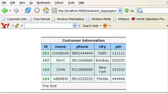
Rendered Output : This is the output of dataTable component.
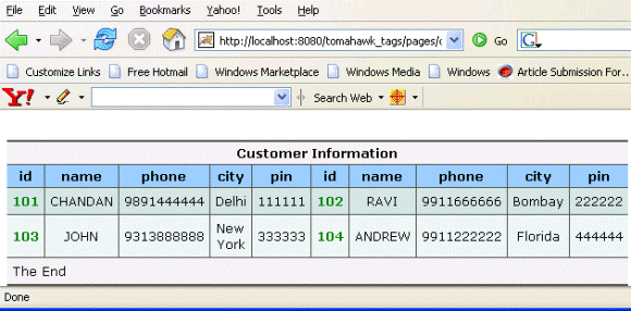
If we set the newspaperColumns attribute to the value "2" then it shows the output like below :
Backing bean :
package net.roseindia.web.ui;
|
Html Source Code :
<html>
<head>
<meta http-equiv="Content-Type" content="text/html; charset=iso-8859-1">
<title>t:dataTable example</title>
<style type="text/css">
<!--
body{
margin-top:30;
}
.TableRow1 {
    background-color: #D0E6E0;
}
.TableRow2 {
    background-color: #E8F7F1;
}
.TableColumn {
    text-align: center
}
.TableClass {
	font-family : verdana, Geneva, Arial, Helvetica, sans-serif;
	font-size: 13px;
	color: #000000;
    padding: 2;
    border-style: solid;
    border-width: 2px;
}
.TableHeader {
	color: #000000;
    background-color: #F1F1F1;
    padding: 3;
    text-align: center;
    border: none;
}
.TableFooter {
    background-color: #F1F1F1;
}
-->
</style>
</head>
<body ><center>
<form id="form1" name="form1" method="post"
   action="/tomahawk_tags/pages/dataTable.jsf;
   jsessionid=CB7EFA115BCB8663FB81A27BD9E1C827"
   enctype="application/x-www-form-urlencoded">
<table id="form1:dt1" bgcolor="#F1F1F1" border="10"
   cellpadding="5" cellspacing="3" frame="hsides" rules="all"
   summary="This is a JSF code to create dataTable." width="50%"
   dir="LTR" class="TableClass">
   <thead>
     <tr><th scope="colgroup" colspan="5" class="TableHeader">
         Customer Information</th></tr>
     <tr><th class="TableHeader" style="background-color:#99CCFF;">
         id</th>
         <th class="TableHeader"
         style="background-color:#99CCFF;">name</th>
         <th class="TableHeader" style="background-color:#99CCFF;">
             phone</th>
         <th class="TableHeader" style="background-color:#99CCFF;">
             city</th><th class="TableHeader"
             style="background-color:#99CCFF;">pin</th>
     </tr>
   </thead>
   <tfoot>
     <tr><td colspan="5" class="TableFooter">
	The End</td></tr></tfoot>
    <tbody id="form1:dt1:tbody_element">
      <tr class="TableRow1">
         <td class="TableColumn" style="color:green;
             font-weight:bold">101</td>
         <td class="TableColumn">CHANDAN</td>
         <td class="TableColumn">9891444444</td>
         <td class="TableColumn">Delhi</td>
         <td class="TableColumn">111111</td>
      </tr>
      <tr class="TableRow2">
         <td class="TableColumn"
             style="color:green;font-weight:bold">102</td>
         <td class="TableColumn">RAVI</td>
         <td class="TableColumn">9911666666</td>
         <td class="TableColumn">Bombay</td>
         <td class="TableColumn">222222</td>
      </tr>
      <tr class="TableRow1">
         <td class="TableColumn"
             style="color:green; font-weight:bold">103</td>
         <td class="TableColumn">JOHN</td>
         <td class="TableColumn">9313888888</td>
         <td class="TableColumn">New York</td>
         <td class="TableColumn">333333</td>
      </tr>
      <tr class="TableRow2">
         <td class="TableColumn"
             style="color:green; font-weight:bold">104</td>
         <td class="TableColumn">ANDREW</td>
         <td class="TableColumn">9911222222</td>
         <td class="TableColumn">Florida</td>
         <td class="TableColumn">444444</td>
      </tr>
   </tbody>
</table>
<br><br>
<input type="hidden" name="form1_SUBMIT" value="1" />
<input type="hidden" name="javax.faces.ViewState"
       id="javax.faces.ViewState"
value="rO0ABXVyABNbTGphdmEubGFuZy5PYmplY3Q7kM5YnxBzKWwCAAB4cAAAAAN0A
       AExcHQAFC9wYWdlcy9kYXRhVGFibGUuanNw" /></form>
</center><!-- MYFACES JAVASCRIPT -->
</body>
</html>
|
This tag contains attributes given below :
- id : This is the value which is used to uniquely identify the component within the closest container like form or subview. The main thing to remember is that its value must be a static value.
- binding : This attribute is used to specify the property of the backing bean with which this component instance is to be bound.
- rendered : Its default value is true. If this attribute is set to true then this component is presented in the page to the user. If false, then this component is not rendered.
- columnClasses : Comma seperated list of CSS classes that will be applied to the columns of this table.
- footerClass : This attribute takes Space-separated list of CSS style class or classes that will be applied to aheaderter generated for this table.
- headerClass :This attribute takes Space-separated list of CSS style class or classes that will be applied to any header generated for this table.
- rowClasses :It is a list of CSS classes applied to the rows of the table. These classes should be separated by comma. If we want to apply CSS class for individual rows then we can specify space separated list of CSS classes. Style classes are applied to rows in the same order that they are defined. If we have two CSS classes then first class is applied to the first row and the second one is applied to the second. Then again in the third row, the first CSS is applied and so on. This process goes on till the last row of the table.
- dir : It is used to set the direction of the text to be displayed. It can take two values LTR(left to right) and RTL (right to left).
- lang : It is used to set the base language of the component when displayed.
- style : It is used to set the CSS style definition for the component.
- title : It is the standard html attribute. It is used to set the tooltip text for this component.
- styleClass : It is used to set the CSS class for the component. It is same as html class attribute.
- onclick : Script to be invoked when the element is clicked.
- ondblclick : It is used for Java Script code to be invoked when the element is double-clicked.
- onmousedown : It is used for Java Script code to be invoked when the pointing device is pressed over this element.
- onmouseup : It is used for Java Script code to be invoked when the pointing device is released over this element.
- onmouseover : It is used for Java Script code to be invoked when the pointing device is moved into this element.
- onmousemove : It is used for Java Script code to be invoked when the pointing device is moved while it is in this element.
- onmouseout : It is used for Java Script code to be invoked when the pointing device is moved out of this element.
- onkeypress : It is used for Java Script code to be invoked when a key is pressed over this element.
- onkeydown : It is used for Java Script code to be invoked when a key is pressed down over this element.
- onkeyup : It is used for Java Script code to be invoked when a key is released over this element.
- align : This attribute is used to set the horizontal alignment of the component.
- border : This attribute is used to specify the width of the border of this element.
- bgcolor : This attribute is used to specify background color of the element.
- cellpadding : This sets the space between the content and the border of the cell.
- cellspacing : It specifies the amount of space to leave between cells.
- frame : This
attribute specifies which sides of the frame surrounding this table will be
visible. This attribute can take some values shown below :
- none No side, Default Value
- above Top side only
- below Bottom side only
- hsides Top and bottom sides only
- vsides Right and left sides only
- lhs Left hand side only
- rhs Right hand side only
- box All four sides
- border All four sides
- rules : This
attribute is used to draw lines between cells. It can take some values given
below :
- none No rules, default value
- groups Between row groups
- rows Between rows only
- cols Between columns only
- all Between all rows and columns
- summary : You can specify summary of the purpose of the table.
- width : This is used to set the width of the entire table. Its value is specified in %. Suppose we set it to 50% then this table will be shown in the 50% space of the width of your screen.
- value : It represents the value of the component. It represents the value over which iteration is to be done. It may be an array or any iterator object .
- var :This is the name of the variable created by the data table that represents the current item in the value. This attribute helps exposing the data in the rows of the table.
- rows : This attribute specifies the number of rows to display. This displaying will be started from the index specified in the "first" attribute. If we set this attribute to zero then all rows will be displayed.
- first : This is used to specify the row number of the first row from which displaying is to be started onwards. Suppose, this property is set to 3,displaying will be started from the third row of the underlying data.
- preserveDataModel : This is a boolean attribute with default value false. When it is set to false, the value binding for the value attribute is executed each time when the page is rendered and if it is set to true then value binding is executed only once when the component is first created and the state is saved by the component. The point to remember while sorting the column is that it should be set to false sothat changes in the Data Model can be applied while sorting.
- preserveRowStates :This a boolean attribute with default value false. This is used to specify whether the state of each row of the table should be discarded before rendering the datatable again. If this attribute is set to true then it can be useful if the input components in datatable has no value binding and the entered value is to be shown again.
- forceIdIndexFormula : This attribute specifies formula that overrides the default row index. Be sure to provide unique value for each row.
- sortColumn : This attribute refers to the modal property that specifies the column name according to which the sorting is to processed.
- sortAscending : This attribute refers to the modal property that specifies the direction of sorting.
- preserveSort : This boolean attribute (default :true) is used to indicate whether the state of the sortColumn and sortAscending attribute should be saved and restored and written back to the model during the update model phase.
- renderedIfEmpty : This boolean attribute (default :true) is used to indicate whether this table should be rendered if the underlying DataModel is empty.
- rowIndexVar : This attribute specifies a parameter name, under which the current rowIndex is set in request scope similar to the var parameter.
- rowCountVar : This attribute specifies a parameter name, under which the rowCount is set in request scope similar to the var parameter.
- previousRowDataVar : This attribute specifies a parameter name, under which the previous RowData Object is set in request scope similar to the rowIndexVar and rowCountVar parameters.
- sortedColumnVar : This attribute specifies a parameter name, under which a boolean is set in request scope similar to the var parameter.
- rowOnClick : It is used for Java Script code to be invoked when table row is clicked.
- rowOnDblClick : It is used for Java Script code to be invoked when table row is double clicked.
- rowOnMouseDown : It is used for Java Script code to be invoked when when a pointer button is pressed down over table row.
- rowOnMouseUp : It is used for Java Script code to be invoked when a pointer button is released over table row.
- rowOnMouseOver : It is used for Java Script code to be invoked when when a pointer button is moved onto table row.
- rowOnMouseMove : It is used for Java Script code to be invoked when a pointer button is moved within table row.
- rowOnMouseOut : It is used for Java Script code to be invoked when a pointer button is moved away from table row.
- rowOnKeyPress : It is used for Java Script code to be invoked when a key is pressed and released over table row.
- rowOnKeyDown : It is used for Java Script code to be invoked when a key is pressed down over table row.
- rowOnKeyUp : It is used for Java Script code to be invoked when a key is released over table row.
- rowId : This attribute is used to set the id for the row.
- rowStyleClass : This attribute is used to set the CSS class for the row.
- rowStyle : This attribute is used to set the CSS style for the row.
- rowGroupStyle : This attribute is used to set the CSS style for grouped rows.
- rowGroupStyleClass : This attribute is used to set the CSS class for grouped row.
- varDetailToggler :
- bodyStyleClass : This attribute is used to set the CSS class for table body.
- bodyStyle : This attribute is used to set the CSS style for table body.
- forceId :This is a boolean attribute with default value false. If this attribute is set to true, the tag is forced to render the id for the component exactly as mentioned in the id attribute of the tag. The benefit of this attribute is that we can reference component by id in the javascript. If we don't use this attribute with the true value then the id for the component is presented in different format.
- forceIdIndex :This is a boolean attribute with default value true. If this value is true then the the component displays the index number in its id value if the component is in a list. If this attribute is set to false then this component will not append index number as suffix . If forcrId is set to false then its value is ignored.
- enabledOnUserRole :f the current user has one of the roles listed in the enabledOnUserRole attribute then enabling or disabling of the component is decided on the base of "disabled" attribute. If disabled attribute is set to true then component is disabled otherwise enabled. If the user is not in the above list then the component is rendered disabled.
- visibleOnUserRole :If the current user has one of the roles listed in the visibleOnUserRole attribute then processing of the component is decided on the base of "rendered" attribute. If the rendered attribute is set to true then component is not rendered otherwise displayed on the page. On the other hand if the current user is not in the above list then the component is not processed.
- newspaperColumns :The value of this attribute defines the number of columns to wrap the table over. The default value for this attribute is "1".
- newspaperOrientation : This attribute decides the orientation of newspaper columns. It can take two values "horizontal" and "vertical" values. The default value is "vertical".