Tomahawk inputTextarea tag
This tag is used to create the input text area component in the page. This component is like inputText but it can take values in multiple lines which can be wrapped in different formats. This tag has additional feature of displaying value only not the widget of the box. This component also has ability to be visible or not visible according to the role of the user. In the same way, it also has the ability to be enabled or disabled according to the user role. This component also has the capability to render the id for the component just the same as we have mentioned in the id attribute of the tag. Normally the naming system of JSF renders the id for the component with some additional text, typically with id of the form as prefix. But this component has an attribute forceId which forces the component to render the same id mentioned in the id attribute.
Code Description :
<%@ taglib uri="http://java.sun.com/jsf/html" prefix="h"%>
<%@ taglib uri="http://java.sun.com/jsf/core" prefix="f"%>
<%@ taglib uri="http://myfaces.apache.org/tomahawk" prefix="t"%>
<f:view>
<html>
<head>
<meta http-equiv="Content-Type" content="text/html; charset=iso-8859-1">
<title>t:inputTextarea example</title>
<style type="text/css">
<!--
body{
background-color:#fff2f2;
margin-top:30;
}
.inputstyle{
background-color:#99CCCC;
}
-->
</style>
</head>
<body ><center>
<t:outputText id="ot" value="<b><p>
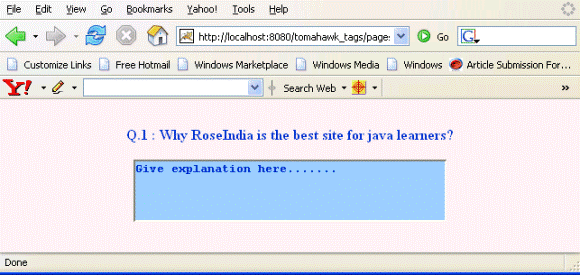
Q.1 : Why RoseIndia is the best site for java learners?
</b>" style="color:#0033CC; font-weight:bold"
title="Q.1" escape="false"/></p>
<t:inputTextarea id="ita" value="Give explanation here......."
cols="40" rows="3" style="color:#0033CC;
background-color:#99CCFF; font-weight:bold"
wrap="physical" title="inputTextarea example"
rendered="true" required="false"/>
</center></body>
</html>
</f:view>
|
Rendered Output :

Html Source Code :
<html>
<head>
<meta http-equiv="Content-Type" content="text/html; charset=iso-8859-1">
<title>t:inputTextarea example</title>
<style type="text/css">
<!--
body{
background-color:#fff2f2;
margin-top:30;
}
.inputstyle{
background-color:#99CCCC;
}
-->
</style>
</head>
<body ><center>
	<span id="ot" title="Q.1" style="color:#0033CC;
		font-weight:bold"><b><p>
		Q.1 : Why RoseIndia is the best site for java learners?</b>
	</span></p>
	<textarea name="ita" id="ita" cols="40" rows="3"
	wrap="physical" title="inputTextarea example" style="color:#0033CC;
		background-color:#99CCFF; font-weight:bold">
		Give explanation here.......
	</textarea>
</center><!-- MYFACES JAVASCRIPT -->
</body></html>
|
This tag contains attributes given below :
- id : This is the value which is used to uniquely identify the component within the closest container like form or subview. The main thing to remember is that its value must be a static value.
- binding : This attribute is used to specify the property of the backing bean with which this component instance is to be bound.
- rendered : Its default value is true. If this attribute is set to true then this component is presented in the page to the user. If false, then this component is not rendered.
- value : The initial value of the component is set to this attribute.
- converter : This attribute is used to specify the converter for the component.
- immediate : This attribute is a boolean attribute that is used to identify the phase during which the value change event should be fired. In normal processing of the event, if immediate attribute is not set to true, the value change event is fired during the invoke application phase but if immediate attribute is set to true then the event is fired at the end of apply request value phase.
- required : This is a boolean attribute. If it is set to true then it is necessary for the component to have the value otherwise an error message is rendered to the user for the component.
- validator : It takes the method binding expression. This expression represents the validator method. This method is called at the time of validation of the component.
- valueChangeListener : This also takes a method binding expression. This expression represents value change listener method. This method will be called when new value is set for this component. you can change the phase of the life cycle when this method should be fired by the use of immediate attribute discussed above.
- cols : This attribute is used to set the width of the component in character.
- rows : This attribute is used to set the height of the component in character.
- wrap : This attribute is user to set the wrapping manner of the text in the component. The wrap attribute allows a text that is longer than the window size to be displayed on more than one line. Its possible values are soft, hard, virtual, physical and off.
- dir : It is used to set the direction of the text to be displayed. It can take two values LTR(left to right) and RTL (right to left).
- lang : It is used to set the base language of the component when displayed.
- style : It is used to set the CSS style definition for the component.
- title : It is the standard html attribute. It is used to set the tooltip text for this component.
- styleClass : It is used to set the CSS class for the component. It is same as html class attribute.
- onclick : Script to be invoked when the element is clicked.
- ondblclick : It is used for Java Script code to be invoked when the element is double-clicked.
- onmousedown : It is used for Java Script code to be invoked when the pointing device is pressed over this element.
- onmouseup : It is used for Java Script code to be invoked when the pointing device is released over this element.
- onmouseover : It is used for Java Script code to be invoked when the pointing device is moved into this element.
- onmousemove : It is used for Java Script code to be invoked when the pointing device is moved while it is in this element.
- onmouseout : It is used for Java Script code to be invoked when the pointing device is moved out of this element.
- onkeypress : It is used for Java Script code to be invoked when a key is pressed over this element.
- onkeydown : It is used for Java Script code to be invoked when a key is pressed down over this element.
- onkeyup : It is used for Java Script code to be invoked when a key is released over this element.
- accesskey : This is standard html attribute. It is used to set the access key for the element which is used to send the focus to the element when pressed.
- disabled : Its a boolean attribute. This is used to disable the element to receive focus, when it is set to true.
- onblur : This attribute sets JavaScript code to execute when the component loses the focus.
- onfocus : This attribute sets JavaScript code to execute when the component receives the focus.
- onchange : This attribute sets JavaScript code to execute when the element is modified.
- onselect : This attribute sets JavaScript code to execute when the element is selected.
- readonly : Its a boolean attribute. It is used to indicate the user that its value can't be modified, if it is set to true.
- tabindex : This is a standard html attribute. It is used to set the order of receiving the focus on the movement of TAB key by the user.
- enabledOnUserRole : If the current user has one of the roles listed in the enabledOnUserRole attribute then enabling or disabling of the component is decided on the base of "disabled" attribute. If disabled attribute is set to true then component is disabled otherwise enabled. If the user is not in the above list then the component is rendered disabled.
- visibleOnUserRole : If the current user has one of the roles listed in the visibleOnUserRole attribute then processing of the component is decided on the base of "rendered" attribute. If the rendered attribute is set to true then component is not rendered otherwise displayed on the page. On the other hand if the current user is not in the above list then the component is not processed.
- forceId : This is a boolean attribute with default value false. If this attribute is set to true, the tag is forced to render the id for the component exactly as mentioned in the id attribute of the tag. The benefit of this attribute is that we can reference component by id in the javascript. If we don't use this attribute with the true value then the id for the component is presented in different format.
- forceIdIndex : This is a boolean attribute with default value true. If this value is true then the the component displays the index number in its id value if the component is in a list. If this attribute is set to false then this component will not append index number as suffix . If forcrId is set to false then its value is ignored.
- displayValueOnly : This is boolean attribute with the default value false. If this value is set to true then only the value of the component is rendered not the widget of the component.
- displayValueOnlyStyle : This attribute is used to specify the style used when displayValueOnly is true.
- displayValueOnlyStyleClass : This attribute is used to specify the style class used when displayValueOnly is true.
