Apache MyFaces Examples
Examples provided by the myfaces-example-simple-1.1.6.war file provides the code for every example. Downloading and deploying this war file in the Tomcat6.0 server has been described in the previous tutorial Downloading and exploring MyFaces examples integrated with Tomahawk. Just go to webapps\myfaces directory of Tomcat server and open JSP file for the examples. In this tutorial, some examples have been explored to understand the usage of the tags and its attributes to create components like File Uploading, Calendar, Menu, Data Scrolling, Tabbed Pane and many more useful components. So let's go through some examples :
Data Scroller Example:(dataScroller.jsp)
This example provides the feature of displaying certain
amount of table data at a time and scrolling the next data of the table. You can
see how to code for this functionality. You can create table using <t:dataTable>
tag and for scrolling use <t:dataScroller> tag. This tag provides an
attribute "for" in which we have to mention the "id" of the
table for which the scrolling is to be performed.
Code for creating table :
| <t:dataTable id="data" styleClass="scrollerTable" headerClass="standardTable_Header" footerClass="standardTable_Header" rowClasses="standardTable_Row1,standardTable_Row2" columnClasses="standardTable_Column,standardTable_ColumnCentered,standardTable_Column" var="car" value="#{scrollerList.list}" preserveDataModel="false" rows="10" > <h:column> <f:facet name="header"> </f:facet> <h:outputText value="#{car.id}" /> </h:column> <h:column> <f:facet name="header"> <h:outputText value="#{example_messages['label_cars']}" /> </f:facet> <h:outputText value="#{car.type}" /> </h:column> <h:column> <f:facet name="header"> <h:outputText value="#{example_messages['label_color']}" /> </f:facet> <h:outputText value="#{car.color}" /> </h:column> </t:dataTable> |
Code for scrolling the data of the table above :
| <t:dataScroller id="scroll_1" for="data" fastStep="10" pageCountVar="pageCount" pageIndexVar="pageIndex" styleClass="scroller" paginator="true" paginatorMaxPages="9" paginatorTableClass="paginator" paginatorActiveColumnStyle="font-weight:bold;" immediate="true" actionListener="#{scrollerList.scrollerAction}" > <f:facet name="first" > <t:graphicImage url="images/arrow-first.gif" border="1" /> </f:facet> <f:facet name="last"> <t:graphicImage url="images/arrow-last.gif" border="1" /> </f:facet> <f:facet name="previous"> <t:graphicImage url="images/arrow-previous.gif" border="1" /> </f:facet> <f:facet name="next"> <t:graphicImage url="images/arrow-next.gif" border="1" /> </f:facet> <f:facet name="fastforward"> <t:graphicImage url="images/arrow-ff.gif" border="1" /> </f:facet> <f:facet name="fastrewind"> <t:graphicImage url="images/arrow-fr.gif" border="1" /> </f:facet> </t:dataScroller> |
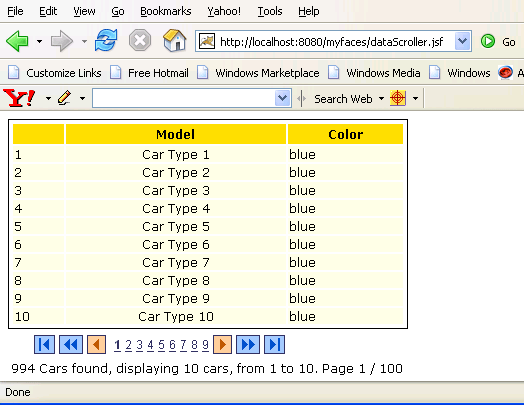
This tag provides attribute fastStep to specify the number of rows to be displayed at a time. As in this example, this attribute has been set to "10" so 10 rows are displayed at a time. paginatorMaxPages has been set to "10" so there are 10 integer numbers displayed. The number on which we click, the data corresponding to that page is opened. We can see this in the figure below :
Tabbed Pane Example:(tabbedPane.jsp)
This example explains creating tabbed Pane. You can
create tabbed pane using <t:panelTabbedPane> tag. This tag provides
a boolean attribute "serverSideTabSwitch" which is used to
declare the component as client side or server side component. If it is set to "true"
then it is treated as server side component and if "false"
then client side. <t:panelTab> tag is used to create tabs. The
content that is to be displayed in the tab is coded with in this tag. The code
before first <t:panelTab> tag is displayed in all the tabs in the beginning
and the code after the last <t:panelTab> tag is also displayed at
the bottom of all the tabs.
| <t:panelTabbedPane bgcolor="#FFFFCC"
serverSideTabSwitch="false"> <f:verbatim><p></f:verbatim> <h:outputText value="#{example_messages['tabbed_common']}"/> <f:verbatim></p></f:verbatim> <t:panelTab id="tab1" label="#{example_messages['tabbed_tab1']}" rendered="#{tabbedPaneBean.tab1Visible}"> <h:selectBooleanCheckbox id="testCheckBox" value="#{testCheckBox.checked}"/> <h:outputLabel for="testCheckBox" value="A checkbox"/> <f:verbatim><br/><br/></f:verbatim> <h:inputText id="inp1"/><f:verbatim><br></f:verbatim> <h:inputText id="inp2" required="true" /><h:message for="inp2" showSummary="false" showDetail="true" /> </t:panelTab> <t:panelTab................................................. ............................................................ ............................................................ </t:panelTab> <t:panelTab................................................. ............................................................ ............................................................ </t:panelTab> <f:verbatim><br/><hr/><br/></f:verbatim> <h:selectBooleanCheckbox value="#{tabbedPaneBean.tab1Visible}"/> <h:outputText value="#{example_messages['tabbed_visible1']}"/> <f:verbatim><br></f:verbatim> <h:selectBooleanCheckbox value="#{tabbedPaneBean.tab2Visible}"/> <h:outputText value="#{example_messages['tabbed_visible2']}" /> <f:verbatim><br></f:verbatim> <h:selectBooleanCheckbox value="#{tabbedPaneBean.tab3Visible}"/> <h:outputText value="#{example_messages['tabbed_visible3']}" /> <f:verbatim><br></f:verbatim> <h:commandButton value="#{example_messages['tabbed_submit']}" /> <t:panelTabbedPane> |
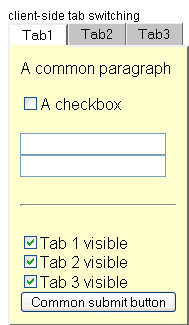
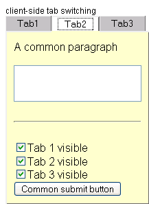
Three figures below shows the content of each tab. Just see "A common paragraph" string is displayed above for all the tabs and a horizontal line, three check boxes and a button labeled "Common submit button" is also displayed at the bottom for all the tabs. The rest content for the individual tabs depends on the code written within opening and closing <t:panelTab> tag.

File Upload Example:(fileupload.jsp)
File uploading is the concept of uploading the file to
the server. The component for this purpose is created using <t:inputFileUpload>
tag. Do remember to include "enctype" attribute in the form
tag and set to "multipart/form-data". You must enable the
MultiPart Filter to make the component work. For this you have to add the code
below in the web.xml file.
| <filter> <filter-name>extensionsFilter</filter-name> <filter-class>org.apache.myfaces.webapp.filter.ExtensionsFilter</filter-class> <init-param> <description>Set the size limit for uploaded files. Format: 10 - 10 bytes 10k - 10 KB 10m - 10 MB 1g - 1 GB </description> <param-name>uploadMaxFileSize</param-name> <param-value>100m</param-value> </init-param> <init-param> <description>Set the threshold size - files below this limit are stored in memory, files above this limit are stored on disk. Format: 10 - 10 bytes 10k - 10 KB 10m - 10 MB 1g - 1 GB </description> <param-name>uploadThresholdSize</param-name> <param-value>100k</param-value> </init-param> </filter> <filter-mapping> <filter-name>extensionsFilter</filter-name> <url-pattern>*.jsf</url-pattern> </filter-mapping> <filter-mapping> <filter-name>extensionsFilter</filter-name> <url-pattern>/faces/*</url-pattern> </filter-mapping> |
To create file upload component we can use <t:inputFileUpload > tag.
| <h:form id="form1" enctype="multipart/form-data" > ..................... .................... <t:inputFileUpload id="fileupload" accept="image/*" value="#{fileUploadForm.upFile}" storage="file" styleClass="fileUploadInput" required="true" maxlength="200000"/> ..................... .................... </h:form> |
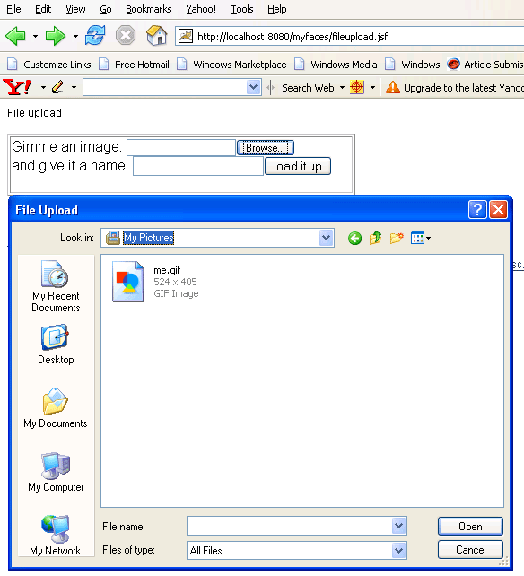
The figure given below displays the uploading of the file :
Calendar Example: (calendar.jsp)
This
example creates calendar using <t:inputCalendar>.
| <t:inputCalendar id="secondOne" monthYearRowClass="yearMonthHeader" weekRowClass="weekHeader" popupButtonStyleClass="standard_bold" currentDayCellClass="currentDayCell" value="#{calendarBean.secondDate}" renderAsPopup="true" popupTodayString="#{example_messages['popup_today_string']}" popupDateFormat="MM/dd/yyyy" popupWeekString="#{example_messages['popup_week_string']}" helpText="MM/DD/YYYY" forceId="true"/> |
In this if we set renderAsPopup attribute to "true" then it displays the calendar as a Java Script popup on client. We can see this type of calendar in the figure below :
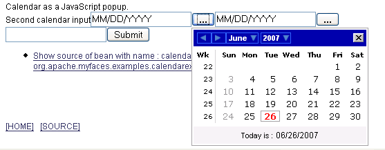
The date format displayed on the client side, when date is selected in the calendar, is specified by the popupDateFormat tag. popupTodayString tag is used to set the string for "Today is ". If we set this attribute to "The date today is :" then "The date today is :" will be displayed instead of "Today is ". popupWeekString tag is used to set the string for "Wk". If we set this attribute to "week" then "week" is displayed instead of "Wk". helpText attribute is used to set the string that will be displayed to help the user to get the correct format of date to enter in the field.
Menu Example:(jscookmenu.jsp)
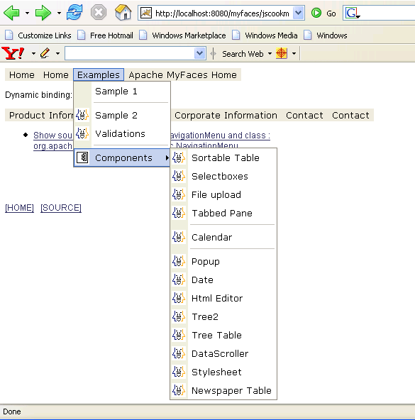
jscookMenu tag is used to create Menu component. navigationMenuItem (s) nested
within jscookMenu tag are rendered as Java Script Menu. The label for the
menu item is set by the attribute itemLabel of navigationMenuItem tag.
If we want to split the item into sub-items then split attribute of
navigationMenuItem tag is set to "true". The code to understand
these facts is given below :
| <t:jscookMenu
layout="hbr" theme="ThemeOffice" styleLocation="css/jscookmenu">
<t:navigationMenuItems id="nav_0" |
The menu and its items for the example looks as below:
0
