Grid layout container


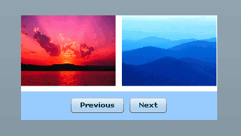
Grid container places the child components in columns and rows. This is very similar to html tables. Inside the Grid tag, GridRow tag is used to represent the row for the table. GridItem tag inside the GridRow is used to place the actual components in the grid. Adding multiple GridRow tags will create that many rows for the grid.
|
<?xml version="1.0" encoding="utf-8"?> <mx:Application xmlns:mx="http://www.adobe.com/2006/mxml" layout="absolute"> <mx:Grid width="280" height="150" x="100" y="100" backgroundColor="white"> <mx:GridRow width="100%" height="100%"> <mx:GridItem width="100%" height="100%"> <mx:Image source="assets/images/Sunset.jpg" width="135" height="103"/> </mx:GridItem> <mx:GridItem width="100%" height="100%"> <mx:Image source="assets/images/Blue hills.jpg" width="135" height="103"/> </mx:GridItem> </mx:GridRow> <mx:GridRow width="100%" height="100%" backgroundColor="#99CCFF"> <mx:GridItem width="174" height="100%" colSpan="2" horizontalAlign="center" verticalAlign="middle"> <mx:Button label="Previous"/> <mx:Button label="Next"/> </mx:GridItem> </mx:GridRow> </mx:Grid> </mx:Application> |
Output:
Download the code:
GridLayoutContainer.zip