JSF outputLabel Tag
This is the outputLabel tag which show the text labeled with the specific component created in your application. This is tag is used under the specific JSF html tag for creating a component because the outputLabel tag is only used for a component.
Code Description:
<%@ page contentType="text/html" %>
<%@ taglib uri="http://java.sun.com/jsf/html" prefix="h" %>
<%@ taglib uri="http://java.sun.com/jsf/core" prefix="f" %>

<f:view>
<html>
     <head><title>jsf h:outputLabel example</title></head>
     <body>
          <h:inputText id="name">
               <h:outputLabel for="name" value="Enter your name: "/>
          </h:inputText>
     </body>
</html>
</f:view> |
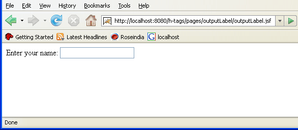
Above code creates a output label having text "Enter your name: " for a text box as you see in the following output image.
Rendered Output:

Following code is the browser generated html code regarding the above used JSF code of the program.
HTML Source Code:
<html> <head><title>jsf h:outputLabel example</title></head> <body> <label for="name">Enter your name: </label> <input id="name" type="text" name="name" /> </body> </html> |
All attributes of the JSF HTML outputLabel tag are explained as follows:
- accesskey: This is an attribute of the outputLink tag that sets the key by pressing that key you can transfer the focus on the specific element or a component.
- binding: This attribute sets or gets values from the property of a backing bean by the value-binding expression accepted by the attribute of the outputLink tag.
- converter: This attribute sets a converter instance to be registered for the component. This instance must match the converter-id value of a converter element that is defined in the faces-config.xml file.
- dir: This attribute sets the direction of the text. Value of the attribute is "LTR" means left-to-right and "RTL" means right-to-left.
- for: This attribute sets the component identification for which it has to be used.
- id: This attribute sets the identification of the component uniquely. The value of the attribute must be unique in the closest.
- lang: This attribute sets language code for using in the markup generated by the component.
- onblur: This attribute sets JavaScript code to execute when the component loses the focus.
- onclick: This attribute sets JavaScript code to execute when the component is clicked.
- ondblclick: This attribute sets JavaScript code to execute when the component is double clicked.
- onfocus: This attribute sets JavaScript code to execute when the component receives the focus.
- onkeydown: This attribute sets JavaScript code to execute when a key is pressed down over the component.
- onkeypress: This attribute sets JavaScript code to execute when a key is pressed or released over the component.
- onkeyup: This attribute sets JavaScript code to execute when a key is released over the component.
- onmousedown: This attribute sets JavaScript code to execute when the mouse pointer is pressed over the component.
- onmousemove: This attribute sets JavaScript code to execute when the mouse pointer is moved within the component.
- onmouseout: This attribute sets JavaScript code to execute when the mouse pointer is moved away from the element or the component.
- onmouseover: This attribute sets JavaScript code to execute when the mouse pointer is moved onto the component.
- onmouseup: This attribute sets JavaScript code to execute when the mouse pointer is released over the component.
- rendered: This attribute take a boolean flag value that indicates the component whether or not should be rendered in the view.
- required: This attribute takes a boolean flag value that determines whether a user will enter a value in the field before the submission of the form or not.
- style: If you want ot add any CSS with the component then you can put the style as the value of the attribute. Added CSS will be applied on for the component.
- styleClass: This attribute holds the CSS class name which is defined in the external style sheet.
- tabindex: This attribute sets the tab index for the component. When you press the TAB key then the component will be focused after focusing all those components whose tab index is less than the component.
- title: This attribute holds a string value that is shown as a tool-tip text of a component or element.
- value: This attribute sets the current value for the component.
