
Running the load test


You can also view the graph for your test after running it. For this go to Thread group -> Add -> Listener -> Graph results as shown in the picture below. After clicking on the graph element, you will see the chart getting populated with the data representing requests to the server.
 |
 |
The chart above shows the Test results with number of threads = 5, ramp-up time = 10, loop count = 100, and loop controller set to 1.
Three parameters on the charts have been displayed - throughput (green line), median (purple line) and average (blue line). If we modify the parameters to simulate a higher load on a server by increasing the number of threads to 50, and changing the ramp-up time to 5 and loop count to 20, then we get the following graph by clicking the start again.
 |
The meaning of the parameters at the bottom of the
chart is as follows:
- The number of requests processed by the server per minute is denoted by Throughput.
- Average is being calculated as the total time running divided by number of requests sent to the server.
- Time is represented by Median i.e. server's half response time is lower than this number.
- The variation in the server's response time is denoted by Deviation.
- The completion of any last request is shown by Latest.
The summary of the above two runs is shown below in the form of a table.
| Number of threads | Throughput, responses/minute | Average, ms | Median, ms |
| 5 | 1665 | 57 | 31 |
| 50 | 1749 | 314 | 62 |
You can also add the Spline Visualizer to further visualize the test results of all sample times. It provides a smooth view of distribution based on polynomial approximations as a continuous line. The picture below displays the screen of Spline Visualizer.
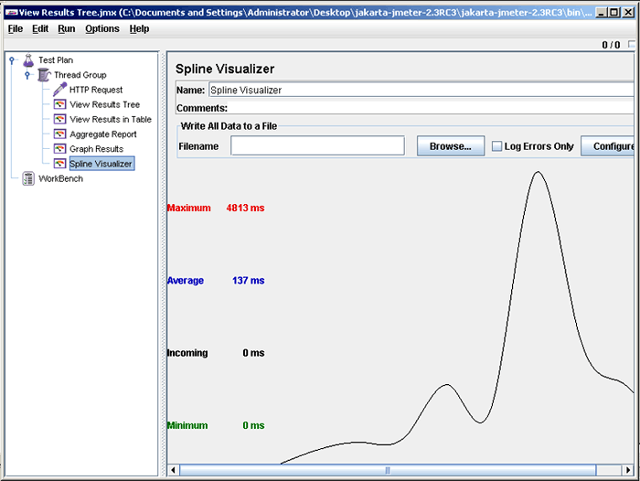 |
The same test results have been shown using Spline Visualizer.