Flex ToolTip Style and StyleManager
In this Tutorial we can illustrate how to set Style for ToolTip in Flex and how to use StyleManager to set Style for ToolTip
In this Tutorial we can illustrate how to set Style for ToolTip in Flex and how to use StyleManager to set Style for ToolTipSet ToolTip Style In Flex:-
We discuss about how to set 'Style' for the tooltip in Flex with the help of <mx:Style> Tag. In this tutorial you can see the process of set style. Using Style you can change look and feel of the tooltip. we can set 'fontSize', 'fontFamily', 'fontStyle', 'color' etc for the tool tip.
Example are given below:-
<?xml version="1.0"?>
<mx:Application xmlns:mx="http://www.adobe.com/2006/mxml">
<mx:Style>
ToolTip {
fontFamily: "Arial";
fontSize: 16;
fontStyle: "normal";
color: #CC66FF;
backgroundColor: #0B3B0B;
corner-radius:5;
}
</mx:Style>
<mx:Panel width="250" height="250" horizontalAlign="center" verticalGap="25" title="ToolTip set style">
<mx:Image id="img" source="@Embed(source='assets/flower.jpeg')" toolTip="It is a beautiful flower"/>
</mx:Panel>
</mx:Application>
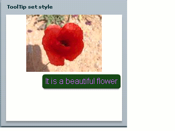
Running this code in your flex environment and you can see output like this:

You can see stylist tool tip for a Image in this example.
After that we can discuss about how to use style Manager to set Style for ToolTip in flex. In this example you can see the use of style Manager to set Style for Image. And you also see set Width of tooltip in this example.
<?xml version="1.0"?>
<mx:Application xmlns:mx="http://www.adobe.com/2006/mxml" creationComplete="setToolTipStyleThroughStyleManager(),init()">
<mx:Script><![CDATA[
import mx.styles.StyleManager;
import mx.controls.ToolTip;
public function init():void {
ToolTip.maxWidth =200;
}
private function setToolTipStyleThroughStyleManager():void {
StyleManager.getStyleDeclaration("ToolTip").setStyle("fontStyle","normal");
StyleManager.getStyleDeclaration("ToolTip").setStyle("fontSize","16");
StyleManager.getStyleDeclaration("ToolTip").setStyle("fontFamily","Arial");
StyleManager.getStyleDeclaration("ToolTip").setStyle("color","#CC66FF");
StyleManager.getStyleDeclaration("ToolTip").setStyle("backgroundColor","#0B3B0B");
}
]]></mx:Script>
<mx:Panel width="300" height="250" horizontalAlign="center" verticalGap="25" title="ToolTip set style with the help of styleManager">
<mx:Image id="img" source="@Embed(source='assets/flower.jpeg')" toolTip="It is a beautiful flower."/>
</mx:Panel>
</mx:Application>
Style Manager :-
The class mx.styles.StyleManager define the StyleManager which manage all styles on all components instance. The StyleManager main task are manage style for each component instance. In this example StyleManager are use two methods that's getStyleDeclaration() and setStyle() to set ToolTip Style. The getStyleDeclaration() method are use to to find out the graphical component and setStyle() method are use to set Style for the ToolTip.
In this example we have set width for ToolTip that's init() method.
Running this code after that you can see output like this:
