Flex ToolTip with TabBar and ToolTipManager
In this tutorial we have illustrate how to use ToolTip with TabBar and how to use ToolTip Manager in flex
In this tutorial we have illustrate how to use ToolTip with TabBar and how to use ToolTip Manager in flexToolTips with TabBar controls in Flex:-
In this tutorial we can illustrate about ToolTip with TabBar controls. You can see how to use tooltip in TabBar controls. TabBar class support ToolTip their data providers.
In the following example you can see how to create TooiTip for Tabbar controls.
<?xml version="1.0"?>
<mx:Application xmlns:mx="http://www.adobe.com/2006/mxml">
<mx:Panel title="ToolTips with TabBar controls" width="200" height="200">
<mx:TabBar dataProvider="{viewstack1}"/>
<mx:ViewStack id="viewstack1" width="166" height="124" selectedIndex="0">
<mx:Canvas label="Flower" width="200" height="200">
<mx:Image id="img1" source="@Embed(source='assets/flower.jpeg')" toolTip="It is a beautiful flower"/>
</mx:Canvas>
<mx:Canvas label="Button" width="155" height="122">
<mx:Image id="img2" source="@Embed(source='assets/button1.jpeg')" toolTip="It is a good Button Image"/>
</mx:Canvas>
</mx:ViewStack>
</mx:Panel>
</mx:Application>
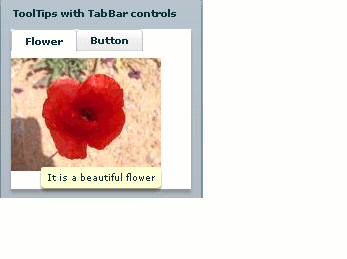
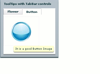
Running this example and see the following output that's given below:

This output for Image control. In this example you can see if user selected flower tab then flower tooltip are arrear.

This output for button control. In this example you can see if user selected Button tab then Button tooltip are arrear.
ToolTip Manager:-
ToolTip Manager class used to manage all ToolTip functions. ToolTip Manager class also set basic needs for ToolTip as how to delay tooltip and how to enable and disable tooltip for the graphical components. ToolTip Manager have showDelay() and hideDelay() methods.
For Example:-
<?xml version="1.0"?>
<mx:Application xmlns:mx="http://www.adobe.com/2006/mxml" creationComplete="init();">
<mx:Script><![CDATA[
import mx.managers.ToolTipManager;
private function init():void {
ToolTipManager.enabled = true;
ToolTipManager.showDelay = 0;
ToolTipManager.hideDelay = 1000; // Hide after 3 seconds of being viewed.
}
]]></mx:Script>
<mx:Panel horizontalAlign="center" width="200" title="Set ToolTip show/hideDelay">
<mx:Image id="img1" source="@Embed(source='assets/button.jpeg')" toolTip="It is a Button Image"/>
<mx:Image id="img2" source="@Embed(source='assets/button1.jpeg')" toolTip="It is a Button1 Image"/>
<mx:Image id="img3" source="@Embed(source='assets/button2.jpeg')" toolTip="It is a It is a Button2 Image"/>
<mx:Image id="img4" source="@Embed(source='assets/flower.jpeg')" toolTip="It is a beautiful flower"/>
</mx:Panel>
</mx:Application>
In this tutorial you can see how to use ToolTip Manager and it's methods for use ToolTip in flex. This example are based on Image components. Output are given below:
