Flex ComboBox Component
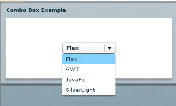
The ComboBox component of Flex is similar to the select option of HTML code. This component also has editable mod. We can specify the data provider by using the Data providers or Collections.
The ComboBox component of Flex is similar to the select option of HTML code. This component also has editable mod. We can specify the data provider by using the Data providers or Collections.Adobe Flex Combo Box Component:
The ComboBox component of Flex is similar to the select option of HTML code.
This component
also has editable mode, in which a user can type on the top of the list. We use
this component inside the mxml section and we can provide an id, if we want to
access this component in any other mxml file or in an actionscript file.
In general drop down list opens downwards, and if the list is long then a scroll
bar appears.
Example:
<?xml version="1.0" encoding="utf-8"?>
<mx:Application xmlns:mx="http://www.adobe.com/2006/mxml" layout="absolute">
<mx:Script>
<![CDATA[
[Bindable]
public var colorPick:Array=['0x000000', '0xFF0000', '0xFF8800',
'0xFFFF00', '0x88FF00', '0x00FF00', '0x00FF88', '0x00FFFF'];
]]>
</mx:Script>
<mx:Panel x="0" y="0" width="344" height="158" title="Combo Box Example"
horizontalAlign="center" verticalAlign="middle">
<mx:ComboBox>
<mx:ArrayCollection>
<mx:String>Flex</mx:String>
<mx:String>GWT</mx:String>
<mx:String>JavaFx</mx:String>
<mx:String>SilverLight</mx:String>
</mx:ArrayCollection>
</mx:ComboBox>
</mx:Panel>
</mx:Application>
