Color Picker in Flex
In this current tutorial we will come to know about the color picker component of Flex. A color picker helps users to select a color of their own choice. A color picker is a component which displays a set of color as swatch and user has to pick a color.
In this current tutorial we will come to know about the color picker component of Flex. A color picker helps users to select a color of their own choice. A color picker is a component which displays a set of color as swatch and user has to pick a color.Adobe Flex Color Picker:
A color picker helps users to select a color of their own choice. A color picker is a component which displays a set of color as swatch and user has to pick a color. The sample panel displays set of colors which is generally called web-safe colors (216 colors).
Adobe Flex Color Picker Example:
<?xml version="1.0" encoding="utf-8"?>
<mx:Application xmlns:mx="http://www.adobe.com/2006/mxml" layout="absolute">
<mx:Script>
<![CDATA[
[Bindable]
public var colorPick:Array=['0x000000', '0xFF0000', '0xFF8800',
'0xFFFF00', '0x88FF00', '0x00FF00', '0x00FF88', '0x00FFFF'];
]]>
</mx:Script>
<mx:Panel x="0" y="0" width="344" height="158" title="Color Picker Example"
horizontalAlign="center" verticalAlign="middle">
<mx:HBox height="100%" width="100%" backgroundColor="{cp.selectedColor}"
borderStyle="solid"/>
<mx:ColorPicker id="cp" dataProvider="{colorPick}" selectedColor="0x00FF88" />
</mx:Panel>
</mx:Application>
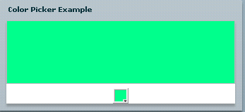
Output:

In the above figure, whenever we select a color from the color picker component,
the HBox component's background will change according to the selection of the
color.